
ITSM Dashboards
On this page
In this lesson, you will learn:
- Reports versus indicators
- What goes on Daniel’s dashboard
- How to lay it out
- How to share it
🔁 Quick look back: Last time: ITSM KPIs Process Owners Watch. You learned the KPIs each SNWR process owner watches, and why each one matters.
1 “I build my slides by hand”
Every Monday, Daniel spends two hours on his weekly slides.
- He exports lists to a spreadsheet.
- He makes charts by hand.
- By Tuesday, the numbers are out of date.
👉 The fix: build one dashboard that’s always up to date.
2 Reports and indicators
Key term: Report
A chart or list of records right now, like open incidents by priority.
Key term: Indicator
A number collected every day, so you can see the trend over time.
Key term: Dashboard
A page with several reports and indicators together.
3 Layout tips
- Most important number top left.
- Trends need indicators; snapshots can be reports.
- Six widgets or fewer.
📦 Entitlement check: Indicators that collect data every day need Platform Analytics. More indicators and features come with ITSM Advanced. Check what SNWR has.
💡 Good to know: Need a refresher? See Fundamentals › Platform Analytics › Building Dashboards.
4 Let’s try it: build the dashboard
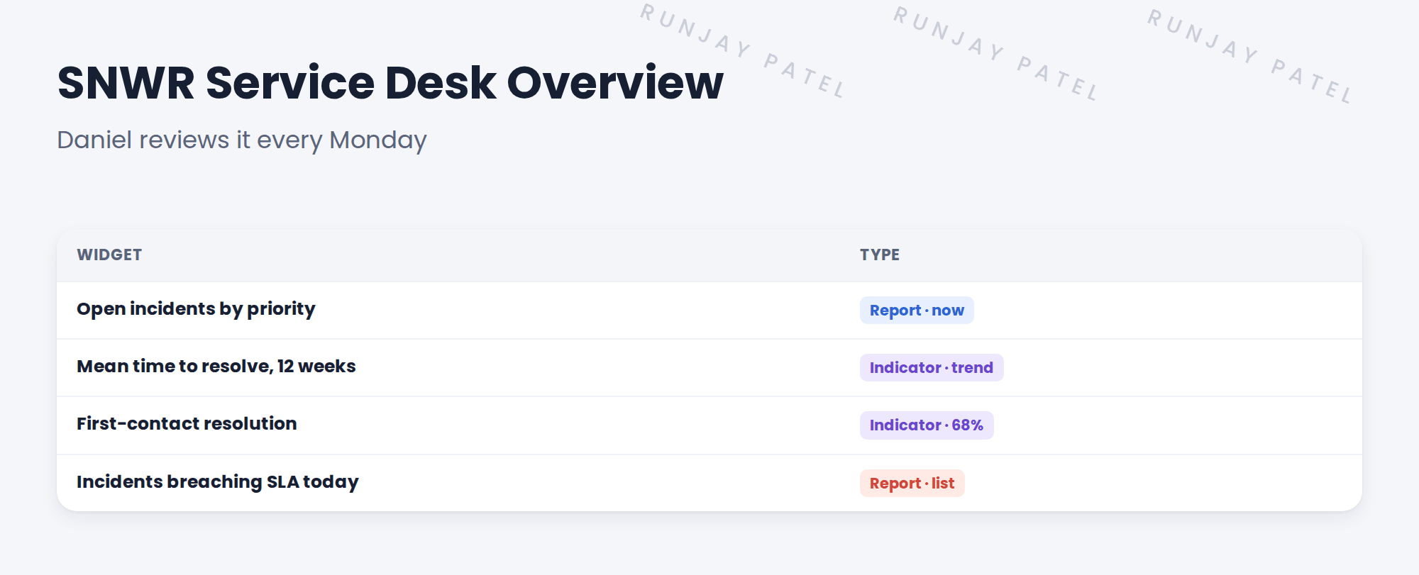
- Open Platform Analytics and create a dashboard named SNWR Service Desk Overview.
- Add a report: open incidents grouped by priority.
- Add the ready-made indicator for mean time to resolve, as a trend.
- Add a list of incidents with a breached SLA.
- Share the dashboard with Daniel and the SNWR Service Desk group.
5 Quick recap
- A report shows now; an indicator shows the trend
- A dashboard puts them together
- Most important number top left
- Six widgets or fewer
- Share it with the people who use it
6 Check yourself
Think of your answer first. Then tap to check.
1 Report or indicator: which shows a 12-week trend? Show answer
An indicator.
2 How many widgets should the dashboard have? Show answer
Six or fewer.
3 Who is SNWR Service Desk Overview for? Show answer
Daniel, for his weekly review.
4 Why a dashboard instead of slides? Show answer
It’s always up to date, with no manual work.
Nice work! Daniel’s Monday review now builds itself. 🎉
Next up: Satisfaction Surveys on Incident Close
Was this lesson helpful?
Please log in to share lesson feedback.
Have a question or doubt?
Ask here and get help from instructors and fellow learners.
Only logged-in learners can post.