
Report Types
On this page
In this lesson, you will learn:
- What a report is in ServiceNow
- The most common report types
- How to pick the right type for your question
1 Turn data into answers
SNWR’s IT manager asks: “How many open incidents do we have, and which team has the most?” You could count rows in a list… or you could build a report. 📊
Key term: Report
A saved chart or table that shows data from one table, often grouped and counted. Reports update every time you open them.
2 Common report types
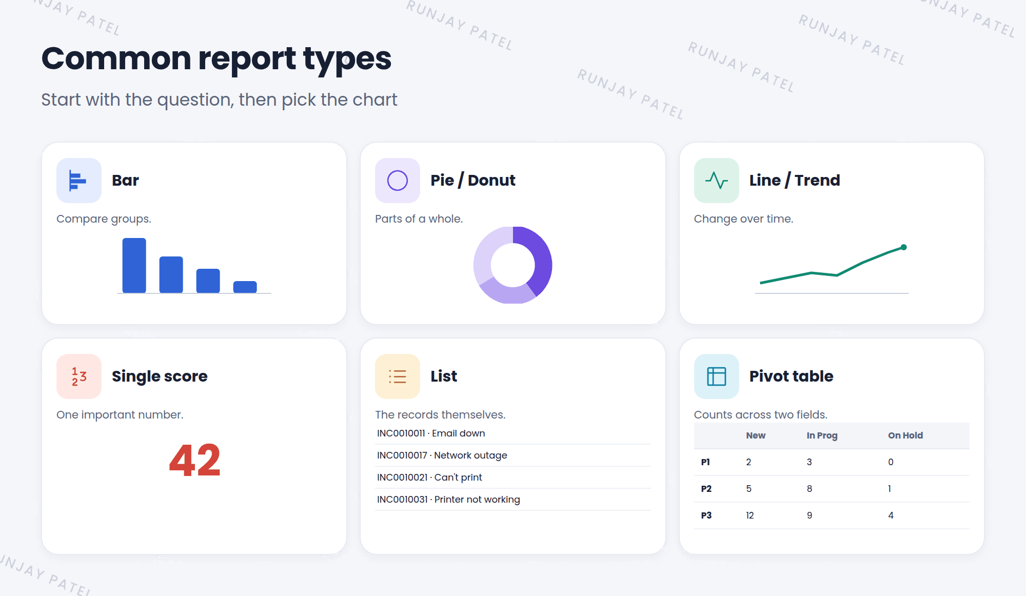
| Type | Best for | Example question |
|---|---|---|
| Bar | Comparing groups | Which team has the most open incidents? |
| Pie / Donut | Parts of a whole | What share of incidents is Hardware? |
| Line / Trend | Change over time | Are incidents going up each week? |
| Single score | One important number | How many P1 incidents are open right now? |
| List | Seeing the records | Which incidents are breaching their SLA? |
| Pivot table | Two fields at once | How many incidents per priority and state? |
💡 Good to know: Start with the question, then pick the chart. If the question is “how many?”, a single score may be all you need.
⚠️ Heads up: Pie charts get hard to read with more than about 6 slices. Use a bar chart instead when there are many groups.
3 Where reports live
- Open Reports > View / Run to see saved reports.
- Reports can be added to dashboards (Chapter 23).
- Reports only show data the viewer is allowed to see.
⭐ Remember: Bar = compare. Pie = share. Line = over time. Single score = one number.
4 Let’s try it: explore reports
- Open Reports > View / Run.
- Open two ready-made reports. What type is each one?
- Click a bar or slice on a chart. What happens? (It opens the list of those records!)
5 Quick recap
- A report turns table data into a chart or table
- Common types: bar, pie, line, single score, list, and pivot
- Pick the type that answers your question
- Click a chart to open the records behind it
6 Check yourself
Think of your answer first. Then tap to check.
1 You want to show whether incidents are rising week by week. Which type? Show answer
A line (trend) chart.
2 Your manager only wants to know how many P1 incidents are open. Which type? Show answer
A single score.
3 Can a report show records the viewer isn’t allowed to see? Show answer
No. Reports follow the same security as everything else.
Nice work! You finished this lesson. 🎉
Was this lesson helpful?
Please log in to share lesson feedback.
Have a question or doubt?
Ask here and get help from instructors and fellow learners.
Only logged-in learners can post.