
Creating Reports
On this page
In this lesson, you will learn:
- How to create a report step by step
- What data source, type, group by, and filter mean
- How to save and change a report
1 The Report Designer
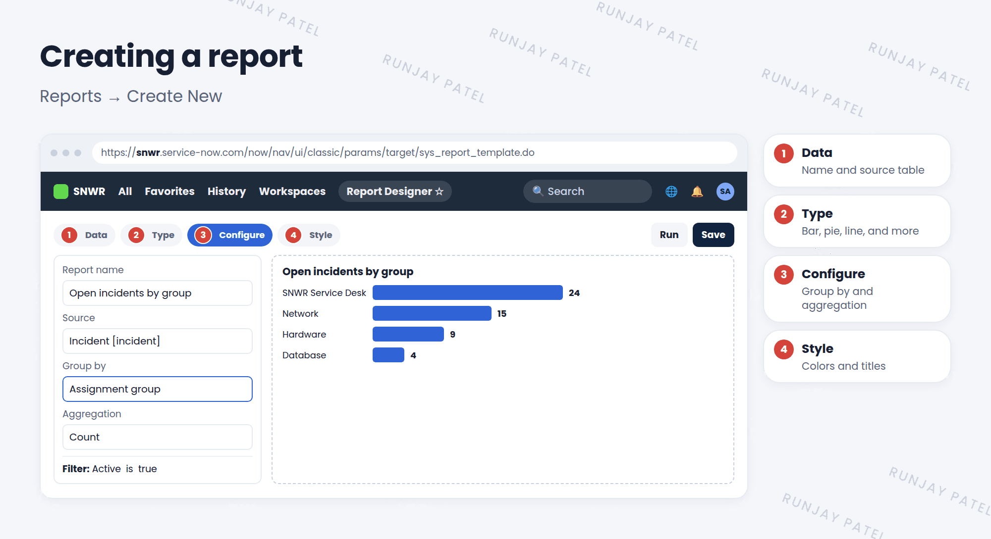
In Lesson 22.1, you looked at reports. Now you’ll build one: a bar chart of SNWR’s open incidents by assignment group. 🛠️
2 Create a report
- Open Reports > Create New.
- Data: give it a name, like “Open incidents by group”. Pick the source: the table, like Incident.
- Type: pick a chart, like Bar.
- Configure: choose Group by, like Assignment group. Choose what to count (usually Count).
- Filter: open the condition builder and add Active is true.
- Click Run to see it, then Save. ✅
| Word | Meaning |
|---|---|
| Source | The table (or a saved data source) the data comes from |
| Group by | The field that splits the data into bars or slices |
| Aggregation | How to measure each group, usually Count |
| Filter | Which records to include (same condition builder as lists) |
💡 Good to know: A quick shortcut: right-click a column header in any list and choose Bar Chart or Pie Chart. It builds a report from the list and its filter.
3 Changing a report
- Open it from Reports > View / Run.
- Change the type, group by, or filter, then Run to preview.
- Click Save to keep the change, or Save as to make a copy.
⚠️ Heads up: A report on a huge table with no filter can be slow. Always add a filter, like Active is true or Opened in the last 30 days.
⭐ Remember: Source → Type → Group by → Filter → Run → Save.
4 Let’s try it: build your first report
- Open Reports > Create New. Name: SNWR Open incidents by group. Source: Incident.
- Type: Bar. Group by: Assignment group.
- Filter: Active is true. Run it.
- Change the type to Pie and run again. Which is easier to read?
- Save it.
5 Quick recap
- Create reports in Reports > Create New
- Pick a source, a type, a group by, and a filter
- Click Run to preview and Save to keep it
- Shortcut: right-click a list column header to chart it
- Always filter big tables
6 Check yourself
Think of your answer first. Then tap to check.
1 Which setting splits the data into bars? Show answer
Group by.
2 How can you make a quick chart straight from a list? Show answer
Right-click a column header and choose Bar Chart or Pie Chart.
3 Your report is very slow. What should you add? Show answer
A filter, to include fewer records.
Nice work! You finished this lesson. 🎉
Was this lesson helpful?
Please log in to share lesson feedback.
Have a question or doubt?
Ask here and get help from instructors and fellow learners.
Only logged-in learners can post.