
Building Dashboards
On this page
In this lesson, you will learn:
- The parts of a dashboard
- How to create a dashboard and add visualizations
- How to share a dashboard
1 One page, many answers
SNWR’s IT manager wants one page that shows: open incidents, P1 incidents, incidents by team, and the weekly trend. That page is a dashboard. 🖥️
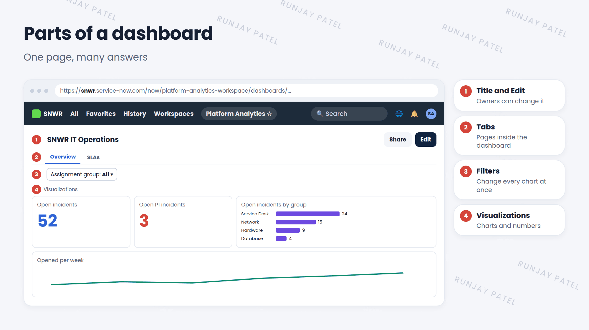
| # | Part | What it does |
|---|---|---|
| 1 | Title and Edit | Name of the dashboard. Edit lets owners change it |
| 2 | Tabs | Split a big dashboard into pages |
| 3 | Filters | Change all charts at once, like “only my team” |
| 4 | Visualizations | The charts and numbers |
2 Build a dashboard
- Open Platform Analytics and go to the Dashboards library.
- Click Create dashboard (or New). Give it a name, like “SNWR IT Operations”.
- Click Edit. Add a visualization: pick a data source, like Incident, and a type, like Single score.
- Set its filter, like Active is true. Add a title.
- Add more visualizations and drag them into place.
- Add a filter for Assignment group, so viewers can pick a team.
- Save. ✅
💡 Good to know: Put the most important number at the top left. That’s where people look first.
3 Share it
- Use the dashboard’s Share option to give other users or groups access.
- You can let them view it, or also edit it.
- As with reports, each viewer only sees data they’re allowed to see.
⚠️ Heads up: Keep dashboards focused. Twenty charts on one page are hard to read. Use tabs, or make separate dashboards for different people.
⭐ Remember: Dashboard = title + tabs + filters + visualizations.
4 Let’s try it: SNWR IT Operations
- Create a dashboard called SNWR IT Operations.
- Add a Single score: Incident, Active is true. Title: “Open incidents”.
- Add a Bar chart: Incident, Active is true, group by Assignment group.
- Add a filter for Assignment group. Try it!
- Share the dashboard with the SNWR Service Desk group.
5 Quick recap
- A dashboard shows many visualizations on one page
- Parts: title, tabs, filters, visualizations
- Build it in Platform Analytics: create, edit, add visualizations, save
- Share it with users and groups to view or edit
- Keep it focused. Most important number top left
6 Check yourself
Think of your answer first. Then tap to check.
1 You want viewers to see just their team’s numbers. What do you add? Show answer
A dashboard filter, like Assignment group.
2 Your dashboard has 20 charts and is hard to read. What can you do? Show answer
Split it into tabs, or make separate dashboards.
3 Where should the most important number go? Show answer
At the top left.
Nice work! You finished this lesson. 🎉
Was this lesson helpful?
Please log in to share lesson feedback.
Have a question or doubt?
Ask here and get help from instructors and fellow learners.
Only logged-in learners can post.