
Next Experience UI Tour
On this page
In this lesson, you will learn:
- What Next Experience is
- The parts of the top bar and what each one does
- Where the main work area is
- How to find your way back when you get lost
1 Welcome to Next Experience
When you log in to your PDI, the screen you see is called Next Experience. It’s the modern look of ServiceNow.
Key term: Next Experience
The current ServiceNow user interface (UI). It has one menu bar at the top that works the same way everywhere.
Key term: Unified Navigation
The dark bar across the top of the screen. It holds the menus, search, and your user menu.
Think of it like the dashboard of a car. 🚗 Once you know where each button is, you can drive any car of that brand.
2 The top bar, piece by piece
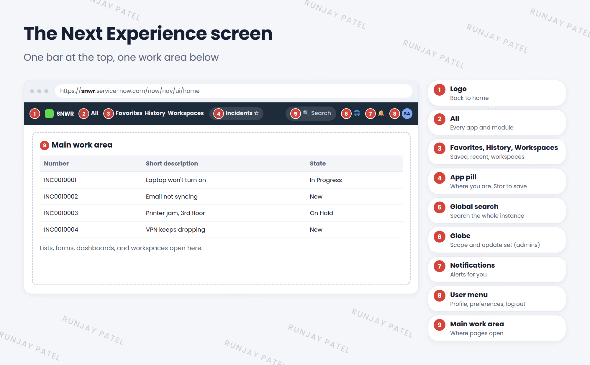
| # | Part | What it does |
|---|---|---|
| 1 | Logo | Takes you back to the home page |
| 2 | All | Opens the full list of apps and modules, with a filter box |
| 3 | Favorites, History, Workspaces | Your saved pages, your recent pages, and your workspaces |
| 4 | App pill | Shows the page you’re on. Click the ⭐ to add it to Favorites |
| 5 | Global search | Searches for words across the whole instance |
| 6 | Globe 🌐 | Shows the current application scope and update set (admins) |
| 7 | Notifications 🔔 | Messages and alerts that are meant for you |
| 8 | User menu | Your profile, preferences, impersonation, and log out |
📝 Note: Admins may also see an Admin menu and an AI assistant icon. What you see depends on your roles and what your company has turned on. That’s normal!
3 The main work area
Everything below the top bar is the main work area. This is where lists, forms, dashboards, and workspaces open.
- Click a module in the All menu, and it opens here.
- The top bar always stays, so you can jump anywhere at any time.
- The app pill changes to show where you are.
⭐ Remember: Lost? Click the logo to go home, or open History to go back to a page you just saw.
4 Next Experience vs the classic look
Before Next Experience, ServiceNow had an older look called Core UI (also called UI16 or “classic”). It had a menu on the left side of the screen instead of at the top.
- Some companies still use the classic look.
- Many admin pages still open in the classic style, inside Next Experience.
- You’ll learn about the classic look in Lesson 10.1.
💡 Good to know: Press Ctrl + / (Windows) or Cmd + / (Mac) to see the keyboard shortcuts for Next Experience.
5 Let’s try it: take the tour
- Log in to your PDI.
- Click All. Scroll through the list of apps, then click All again to close it.
- Open History. What pages have you visited so far?
- Click your user picture (top right). Look at the options, but don’t click any yet.
- Click the logo to go back to the home page. 🏠
6 Quick recap
- Next Experience is the modern ServiceNow look
- The top bar is called Unified Navigation
- It holds: logo, All, Favorites, History, Workspaces, app pill, search, globe, notifications, and user menu
- Pages open in the main work area below the bar
- The older look is called Core UI (UI16 or classic)
7 Check yourself
Think of your answer first. Then tap to check.
1 What is the dark bar at the top of the screen called? Show answer
Unified Navigation.
2 You want to save the page you’re on so you can find it later. What do you click? Show answer
The star on the app pill. It adds the page to Favorites.
3 Which menu shows the pages you visited recently? Show answer
History.
4 What was the older ServiceNow look called? Show answer
Core UI (also called UI16 or classic).
Nice work! You finished this lesson. 🎉
Was this lesson helpful?
Please log in to share lesson feedback.
Have a question or doubt?
Ask here and get help from instructors and fellow learners.
Only logged-in learners can post.